One of the techniques that we used in our music video came from this music video. The technique was using 3 iPhones to film 3 friends meeting in one spot. Each phone is filming one direction. As the actors move…
Thursday, 24 December 2015
Cinematography techniques
One of the techniques that we used in our music video came from this music video. The technique was using 3 iPhones to film 3 friends meeting in one spot. Each phone is filming one direction. As the actors move…
Friday, 18 December 2015

Monday, 14 December 2015
Most effective and Least effective of the edited stills
There are different types of genre in s music video. They
are: performance, narrative and image.
The stills from the video, I have chosen what the most effective video
effect that can be used in a certain genre.
Most Effective
 Performance
For performance, I have used split effect so that it can
show different musicians playing at the same time. In the still, we can see the
person on the top right is playing the piano and the person on the left is
singing. Audience can see clearly that they are performing and show their
individual talent.
 Narrative
I have chosen this still be the most effective for a
narrative genre. The still shows a close up of three teenagers having there tea
break and I have used a title to identify what they are doing and what it is
going to be about “tea time ft. Vince’s lip.” In a music video a title would
show the name of the song which may help the audience what the music video is
going to be about.
 Image
Image
I have chosen to use a close up on the face which shows the
person facial features and the eye line match of the person is looking straight
to the camera which connotes that he is looking at you and also you can see the
facial features of the person. I used a black and white filter to focus on his
face, the hair colour is dark so his face will stand out. I think this is an
effective effect for this genre because his black hair contrasts with his face
so it stands out.

The least effective effect for a performance genre is this still. This is because the effect on the person which is called dazzle is too much and takes over the picture. Also the brightness on the white is too high and makes the desaturation effect even worse. We can't see the person very clearly because of the dazzle effect and it puts away the focus on the artist.

Narrative
The least effective effect for a narrative genre is from this still. The desaturation effect can be used for narrative purposes which will present the past. This means that this effect can be only used if the narrative is about the past and can't be used in the present as it can confuse the audience.

Image
Ideas for music video


From these these screenshots, we used the editing technique layering in our music video to show delay on the footage.


From this video, we used the IPhone idea where two people were on one phone and then the other person moved to other phone. We used this idea because we wanted something new and interesting in our video.
Lucy- we used the phone idea in the end from our research and planning and it is still in our video to date. The idea was extremely successful as a technical code and as well as this is links to the aka genre because it is original and different
Friday, 11 December 2015
Research into Similar Digipacks


The design of all the covers matched together which makes it look good.
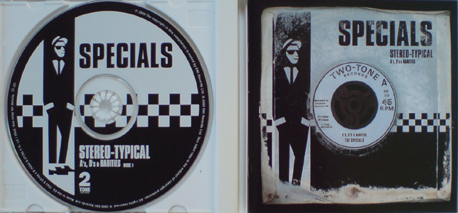
The Specials is a famous ska band which was formed in 1977. thy use black and white colour scheme on digipak and their theme follows throughout the CD. The colour scheme and the image of the man wearing a suit implies that it is old. The name of the band are all in bold capitals to make it stand out as well as having the white outline contrasting with the black background.
Wednesday, 9 December 2015
Magazine advert plan
This
is my plan of what I imagined our magazine advert to be like. As you can see, I
have included aspects that I have learned from previous successful adverts,
such as a big title, the date of release and a feature of the album cover itself,
of which we found in our research.
I have
looked at using the rule of thirds on the band because it is an effective way
of pulling focus onto the main singer (Ben). Not only will this establish him as
the main singer of the band but it would also include the rest of the trio,
this way the audience would be fully aware of the members of the group.
Although
I have not yet used colours on my plan, there is a clear way the members have
been represented. The fact that they are laying on a brick wall, maybe smoking,
plus their outfits, shows that they feel like they can do anything – that they
are free. This creates a representation that they maybe a little troublesome.
The
use of this also creates a representation on the genre of Ska. It would create
an image of Ska music as being a little rebellious and a chilling music of the
younger generation. This would encourage the younger generation to buy the
album or start listening to the band’s music because they would think that this
is what is relevant for them because the advert targets them.


Ben Magazine

Having done research into Ska magazine adverts, I have annotated this A3 piece of paper to show codes and conventions. I have used these as well as looking at other magazine adverts to create my own magazine advert cover.

Music Advertisement

 This is my Music Advertisement drawing which i have drawn down an idea by using the codes and conventions. It includes a picture of the main singer, Ben, which will be manipulated in a way which i have researched and found from the disclosure album. The effect i was trying to draw is on the image to the right. it will also include a preview of the album cover in the corner and it also has a label saying how it features our number 1 hit single 'fast feet'. The back ground is going to be black as the other Ads we looked into are all black and white, but then i am going to contrast it with the colour of his face with the white outline and then the checks along the border are going to be; red and yellow so we have the bright vibrant colours as well. The titles are also going to be bold and colourful with the 'We're all Mad Here' the biggest font so it stands out. I also included the company logo.
 I have reflected the artist to be strange and whacky because its all meant to be a bit 'mad' and fun, and the more strange he looks the more it will attract the audience. I think what went well is that i hav used he conventions of colour and strange to match the album name as well and it includes all aspects of an advertisement. What would be better is to include the date released as well.


Magazine Advert

This is an idea that I have made for the magazine ad. The main title will be in a large font and it will be bold so it will stand out which I have learnt by looking at other magazine and the titles are always big and bold. I have reflected the artist in this magazine ad by featuring the lead singer of the band. also I have to included the footprints at the side to symbolize on of the song in the album.
It would have been better if I feature the entire band in magazine. I haven't added any colours but
I am planning to use red, black and white colours for this magazine advert. I showed the front cover of the album to sell the album.

Sunday, 6 December 2015
Research into Similar Digipacks of the Same Genre


This is the front cover of a 'madness' CD which shows how they have all the band on the front cover in a cartoon form. I reckon this would be effective on ours as it would suit the comedy aspect of our genre. As well they have used a colour scheme throughout of mainly red, white and black but also the union jack colours. Having a set colour throughout I believe looks more professional so I personally prefer that. the back cover has the same theme from the front with the bus. This continuing theme matches throughout which I feel makes it more appealing to the eye which is why I would like that on my own digipack. On the inside they have chosen to say a few thank you's which has made he inside extremely simple, which I would change and maybe choose to put an instrument so that there is more conventions of the genre included.

Design for CD front cover
When playing on Photoshop I found it difficult to come up with something as it was a new software and therefore couldn't get use to the tools. But the design I finally came up with is a bright background using colours which would reflect the liveliness of our music video, and as well as this the colours reflected the reggae vibes of the music's tone as well. I think bright colours would work well on our final product because it goes well with our music video and will reflect our genre well.
I used a picture of Ben as the main focus of the CD cover as he was the main singer. I started to overlay the image in the background but more opaque so there was more of him and I found this effective as it filled the cover and made it clear he was the main singer, however I don't think this will be effective for our final cover. I think this because after looking at other Ska bands music covers they usually have the whole band of them on the front altogether. so when I produce the final CD cover I will take into consideration that the band is a convention of the genre that needs to be included.
Friday, 4 December 2015

Research into Editing Techniques
This music video is another video where we got some inspiration for the editing with in ours. We noticed that in most of it in the forest they have used overlapping sequences to cause the effect of shadowing. We used this on the iconic frame of the dancing feet and this was an effective way of making it stand out and therefore this technique has been used in our video.
I found his effective because it makes an original frame stand out more and its more interesting to watch. It also looks complex and a technique which would be hard to do, when in fact its easy to add onto a frame but it makes the frame stand out to an audience more than an original frame.
Ideas For Music Video
At 2:43 in the video near then end of the video we have taken the idea of the phone concept and added it into our video. We were stuck for ideas on what we could do for one part of the music video and we were just watching some of the most recent and updated music videos to see their ideas, and this idea seemed extremely clever to us. So e adapted it to fit our words and genre and it worked out really well in the end.
Wednesday, 2 December 2015
Music Album Covers recreated
To prepare for our digipak that we will be making, both Darwin and myself (Ben) have found 3 different album covers and have re-created them using different images found on the internet. This has helped us to develop our creativity and give us ideas of what images we will produce for our digipak.


This first album I (Ben) re-created was Lift Your Skinny Fists Like Antennas to Heaven. The re-created album cover uses similar features, including the sandpaper background and the red lines to emphasise the feet. I decided to change the hands into feet when re-craeting the album cover due to it being more relevant, as our music video is named 'Fast Feet'.
 The second album I (Ben) re-created was The Warning. As the Ska music genre involves lots of fun and freedom, this album cover was appealing. All the different shaped cubes looked unique, and the array of colours gave some attention to the black circle which contained the artist and album name. Re-creating this, I used the same idea of cubes, however implemented instruments more relevant to the Ska music genre, such as the trumpet. However, I would preferably do this in RGB if I were to do it for the digipak, not in black & white as the colours are important, and would also include the name of the artist/album.


This first album I (Ben) re-created was Lift Your Skinny Fists Like Antennas to Heaven. The re-created album cover uses similar features, including the sandpaper background and the red lines to emphasise the feet. I decided to change the hands into feet when re-craeting the album cover due to it being more relevant, as our music video is named 'Fast Feet'.

Subscribe to:
Comments (Atom)