One of the techniques that we used in our music video came from this music video. The technique was using 3 iPhones to film 3 friends meeting in one spot. Each phone is filming one direction. As the actors move…
Thursday, 24 December 2015
Cinematography techniques
One of the techniques that we used in our music video came from this music video. The technique was using 3 iPhones to film 3 friends meeting in one spot. Each phone is filming one direction. As the actors move…
Friday, 18 December 2015

Monday, 14 December 2015
Most effective and Least effective of the edited stills
There are different types of genre in s music video. They
are: performance, narrative and image.
The stills from the video, I have chosen what the most effective video
effect that can be used in a certain genre.
Most Effective
 Performance
For performance, I have used split effect so that it can
show different musicians playing at the same time. In the still, we can see the
person on the top right is playing the piano and the person on the left is
singing. Audience can see clearly that they are performing and show their
individual talent.
 Narrative
I have chosen this still be the most effective for a
narrative genre. The still shows a close up of three teenagers having there tea
break and I have used a title to identify what they are doing and what it is
going to be about “tea time ft. Vince’s lip.” In a music video a title would
show the name of the song which may help the audience what the music video is
going to be about.
 Image
Image
I have chosen to use a close up on the face which shows the
person facial features and the eye line match of the person is looking straight
to the camera which connotes that he is looking at you and also you can see the
facial features of the person. I used a black and white filter to focus on his
face, the hair colour is dark so his face will stand out. I think this is an
effective effect for this genre because his black hair contrasts with his face
so it stands out.

The least effective effect for a performance genre is this still. This is because the effect on the person which is called dazzle is too much and takes over the picture. Also the brightness on the white is too high and makes the desaturation effect even worse. We can't see the person very clearly because of the dazzle effect and it puts away the focus on the artist.

Narrative
The least effective effect for a narrative genre is from this still. The desaturation effect can be used for narrative purposes which will present the past. This means that this effect can be only used if the narrative is about the past and can't be used in the present as it can confuse the audience.

Image
Ideas for music video


From these these screenshots, we used the editing technique layering in our music video to show delay on the footage.


From this video, we used the IPhone idea where two people were on one phone and then the other person moved to other phone. We used this idea because we wanted something new and interesting in our video.
Lucy- we used the phone idea in the end from our research and planning and it is still in our video to date. The idea was extremely successful as a technical code and as well as this is links to the aka genre because it is original and different
Friday, 11 December 2015
Research into Similar Digipacks


The design of all the covers matched together which makes it look good.
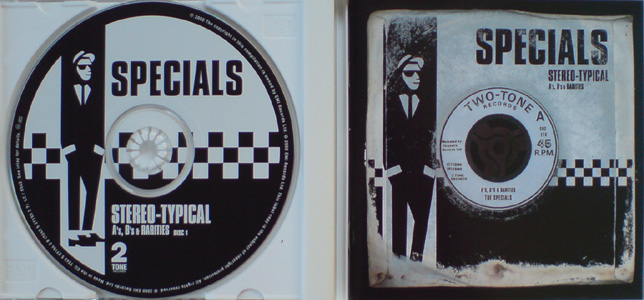
The Specials is a famous ska band which was formed in 1977. thy use black and white colour scheme on digipak and their theme follows throughout the CD. The colour scheme and the image of the man wearing a suit implies that it is old. The name of the band are all in bold capitals to make it stand out as well as having the white outline contrasting with the black background.
Wednesday, 9 December 2015
Magazine advert plan
This
is my plan of what I imagined our magazine advert to be like. As you can see, I
have included aspects that I have learned from previous successful adverts,
such as a big title, the date of release and a feature of the album cover itself,
of which we found in our research.
I have
looked at using the rule of thirds on the band because it is an effective way
of pulling focus onto the main singer (Ben). Not only will this establish him as
the main singer of the band but it would also include the rest of the trio,
this way the audience would be fully aware of the members of the group.
Although
I have not yet used colours on my plan, there is a clear way the members have
been represented. The fact that they are laying on a brick wall, maybe smoking,
plus their outfits, shows that they feel like they can do anything – that they
are free. This creates a representation that they maybe a little troublesome.
The
use of this also creates a representation on the genre of Ska. It would create
an image of Ska music as being a little rebellious and a chilling music of the
younger generation. This would encourage the younger generation to buy the
album or start listening to the band’s music because they would think that this
is what is relevant for them because the advert targets them.


Ben Magazine

Having done research into Ska magazine adverts, I have annotated this A3 piece of paper to show codes and conventions. I have used these as well as looking at other magazine adverts to create my own magazine advert cover.

Music Advertisement

 This is my Music Advertisement drawing which i have drawn down an idea by using the codes and conventions. It includes a picture of the main singer, Ben, which will be manipulated in a way which i have researched and found from the disclosure album. The effect i was trying to draw is on the image to the right. it will also include a preview of the album cover in the corner and it also has a label saying how it features our number 1 hit single 'fast feet'. The back ground is going to be black as the other Ads we looked into are all black and white, but then i am going to contrast it with the colour of his face with the white outline and then the checks along the border are going to be; red and yellow so we have the bright vibrant colours as well. The titles are also going to be bold and colourful with the 'We're all Mad Here' the biggest font so it stands out. I also included the company logo.
 I have reflected the artist to be strange and whacky because its all meant to be a bit 'mad' and fun, and the more strange he looks the more it will attract the audience. I think what went well is that i hav used he conventions of colour and strange to match the album name as well and it includes all aspects of an advertisement. What would be better is to include the date released as well.


Magazine Advert

This is an idea that I have made for the magazine ad. The main title will be in a large font and it will be bold so it will stand out which I have learnt by looking at other magazine and the titles are always big and bold. I have reflected the artist in this magazine ad by featuring the lead singer of the band. also I have to included the footprints at the side to symbolize on of the song in the album.
It would have been better if I feature the entire band in magazine. I haven't added any colours but
I am planning to use red, black and white colours for this magazine advert. I showed the front cover of the album to sell the album.

Sunday, 6 December 2015
Research into Similar Digipacks of the Same Genre


This is the front cover of a 'madness' CD which shows how they have all the band on the front cover in a cartoon form. I reckon this would be effective on ours as it would suit the comedy aspect of our genre. As well they have used a colour scheme throughout of mainly red, white and black but also the union jack colours. Having a set colour throughout I believe looks more professional so I personally prefer that. the back cover has the same theme from the front with the bus. This continuing theme matches throughout which I feel makes it more appealing to the eye which is why I would like that on my own digipack. On the inside they have chosen to say a few thank you's which has made he inside extremely simple, which I would change and maybe choose to put an instrument so that there is more conventions of the genre included.

Design for CD front cover
When playing on Photoshop I found it difficult to come up with something as it was a new software and therefore couldn't get use to the tools. But the design I finally came up with is a bright background using colours which would reflect the liveliness of our music video, and as well as this the colours reflected the reggae vibes of the music's tone as well. I think bright colours would work well on our final product because it goes well with our music video and will reflect our genre well.
I used a picture of Ben as the main focus of the CD cover as he was the main singer. I started to overlay the image in the background but more opaque so there was more of him and I found this effective as it filled the cover and made it clear he was the main singer, however I don't think this will be effective for our final cover. I think this because after looking at other Ska bands music covers they usually have the whole band of them on the front altogether. so when I produce the final CD cover I will take into consideration that the band is a convention of the genre that needs to be included.
Friday, 4 December 2015

Research into Editing Techniques
This music video is another video where we got some inspiration for the editing with in ours. We noticed that in most of it in the forest they have used overlapping sequences to cause the effect of shadowing. We used this on the iconic frame of the dancing feet and this was an effective way of making it stand out and therefore this technique has been used in our video.
I found his effective because it makes an original frame stand out more and its more interesting to watch. It also looks complex and a technique which would be hard to do, when in fact its easy to add onto a frame but it makes the frame stand out to an audience more than an original frame.
Ideas For Music Video
At 2:43 in the video near then end of the video we have taken the idea of the phone concept and added it into our video. We were stuck for ideas on what we could do for one part of the music video and we were just watching some of the most recent and updated music videos to see their ideas, and this idea seemed extremely clever to us. So e adapted it to fit our words and genre and it worked out really well in the end.
Wednesday, 2 December 2015
Music Album Covers recreated
To prepare for our digipak that we will be making, both Darwin and myself (Ben) have found 3 different album covers and have re-created them using different images found on the internet. This has helped us to develop our creativity and give us ideas of what images we will produce for our digipak.


This first album I (Ben) re-created was Lift Your Skinny Fists Like Antennas to Heaven. The re-created album cover uses similar features, including the sandpaper background and the red lines to emphasise the feet. I decided to change the hands into feet when re-craeting the album cover due to it being more relevant, as our music video is named 'Fast Feet'.
 The second album I (Ben) re-created was The Warning. As the Ska music genre involves lots of fun and freedom, this album cover was appealing. All the different shaped cubes looked unique, and the array of colours gave some attention to the black circle which contained the artist and album name. Re-creating this, I used the same idea of cubes, however implemented instruments more relevant to the Ska music genre, such as the trumpet. However, I would preferably do this in RGB if I were to do it for the digipak, not in black & white as the colours are important, and would also include the name of the artist/album.


This first album I (Ben) re-created was Lift Your Skinny Fists Like Antennas to Heaven. The re-created album cover uses similar features, including the sandpaper background and the red lines to emphasise the feet. I decided to change the hands into feet when re-craeting the album cover due to it being more relevant, as our music video is named 'Fast Feet'.

Thursday, 26 November 2015
Monday, 23 November 2015
Raw footage
In this video is a few raw scenes we have filmed compiled into one video. No editing has been implemented to any of these scenes in this video;
 This still shows all band members performing. This is linked to the genre as it shows the lip-synching during the chorus and instruments being played. This is relevant as it shows the genre of the music video is 'performance', which is something you would typically find in a Ska music video from prior research we had done. Because the cinematography shows all members, it is easy to recognise the singer is sitting in the middle and is the focus of attention.
 During this scene, as shown in the still above all members are looking away. In this still a couple seconds later through the scene, the singer faces the camera. This symbolises and reinforces that the singer is the focus of attention, which is something we want to make obvious and display in our music video.
 This close-up of Ben as the main singer is effective as it shows the lip-syncing to the song to be accurate and more convincing to the audience.
 This still refers to the part in the video where the lyrics in the song say 'See your mate with a burger'. This direct relationship between the visuals and the lyrics, which is relevant to Andrew Goodwin's theory.
 As the name of our song is named 'Fast Feet' we thought it would be relevant to have footage of feet dancing quickly. However, we found the footage to be slightly boring by itself and have decided to film two others dancing so that we can edit it to be a 3-way split-screen.
 This is not directly linked to the genre being performance, but to add some diversity to the music video we have added this scene to give a narrative concept to the music video so it is not dominantly performance. As our music video is trying to give off the idea of having fun, this scene as well as others in the future final cut (e.g. the paint scene) helps to tell the audience this through visual references.
To analyse without confusion I have taken a still of each scene from the video:


Alterations made along the Way
Alterations made along the way
During the shooting
of our music video, we have decided to make big and small alterations to our
storyboard to make our video editing and mise-en-scene more relevant to the
song.
In our editing, we
realised that the song is much quicker than we first expected now that we have
our footage to play alongside with, this means that we were forced to cut our
footage much shorter as we were in danger of making our video too slow for the
song. This meant that there are random gaps in our video where we would have to
fill in. Therefore we ran a little over filming schedule for the extra footage
that we needed.
The Green screen
proved to be too difficult film outside due to the fact that in our favoured
locations, it was too hard to differentiate ourselves from the background which
caused parts to disappear. This meant that we had to film in the green screen
room so that this doesn’t happen.
Furthermore, due to
that fact that the weather had been terribly cold and wet during our filming,
we were forced to alter our costume slightly. I originally planned on wearing
shorts with a baggy t-shirt but that proved to be impossible. We were forced to
wear more layers with a coat which is not what we originally planned. However,
our costume still fits into the genre of SKA as it was still baggy, we still
looked trendy and hipster.
Thursday, 19 November 2015
Wednesday, 18 November 2015
Rough Cut feedback
During the process of creating our rough cut, towards reaching the end of the rough cut we had shown our music video to our class to gather some feedback on WWW (What Went Well) and EBI (Even Better If). We have used this information to further improve our music video considering all of the points from each and everyone.
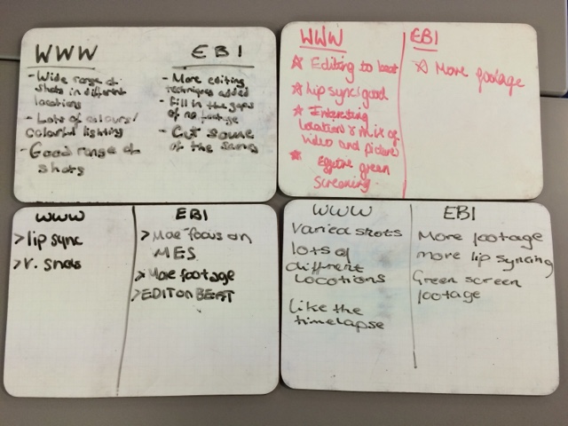

One of the points made which went well that had cropped up numerous times is there was a variety of shots. This is good feedback as it is something we were aiming for the audience to see, as we had filmed in a variety of different locations and also had used different shots. However, something that we could improve on is to ensure the lip synching is in time.

Test/Raw footage
Displayed above is a video showing raw footage from videos that had been taken during the construction of our music video.
Monday, 9 November 2015
Thursday, 5 November 2015
In depth analysis of other music videos
This music video was effective as it used a combination of both narrative and performance aspects, with lip-syncing involved as well as costumes and other mise-en-scene features being emphasised on (as the outfits by the two shown).
 The use of editing through making it look cartoon-like with slide transitions also gave the music video a comic book feel, and with the use of a location such as London it means a larger target audience is able to identify where it was filmed.
 Finally the text editing in spelling out the lyrics gave a direct relationship between the visuals and the lyrics. This makes it easier for the target audience to understand the lyrics which was a unique way of presenting the lyrics, in a way which wasn't traditional lip syncing.
 This music video was again a combination of narrative and performance, dominantly narrative. The cinematography shot throughout the music video was very well done, with a range of shot types.

The use of makeup and props for the mise-en-scene was very well done through the music video and looked very real. The use of boxing equipment in the second photo with the punching bag shows to the audience that the range of props in the shot shows he is training for something, which goes in line with the music when it becomes more up beat and fast paced.


The final music video is a performance video, with the genre being pop.


Monday, 2 November 2015
Logo and Record label

This is our logo for our record label. The record label is Urban Beats Company which is shortened down to UBC. This is because one of our location is a skip which has the letters UBC on so we have made it relevant to our location so it links and has continuity. The slogan is 'Fast Beats, Fast Feet' because our genre of music is very quick paced and the editing is going to be cut to the pace of the beats meaning it is going to be fast, and our name of our song is called 'fast feet' and therefore s catchy and relevant. the picture and colours link because a lot of our video is going to be set around areas round our town and one shot is going to be the sun setting down over the city/town. The colour also shows a bright colour which is going to be used throughout our video.
Subscribe to:
Comments (Atom)