Friday, 23 October 2015

Health and Safety


Health and Safety

During the production of our music videos we will encounter many instances where we will need to be careful that we may retain our health and safety.

When filming our part with the camp fire, it is important to know the dangers when dealing with an open fire. For example, it is important that hair, clothing or hanging items should not be near the open fire that nothing can catch.

http://holycrosskearney.org/wp-content/uploads/2015/10/Campfire.jpg


When jumping in the river, it is important to know that rivers can reach levels of 4 – 5 degrees on certain days. This means that we should not jump in straight away but get used to the temperature first, this way we can avoid getting hyperthermia and shock from the cold. Furthermore, heat reflecting covers should be ready and at hand for when the actor are out of the water so that they may retain their heat.

https://encrypted-tbn2.gstatic.com/images?q=tbn:ANd9GcSRJRsaoXgB1Qb0QKgerQpda4G3Hnq5c7gTCgmbHAfj2WwNJGmd


Wednesday, 21 October 2015

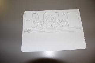
Photographs of work in progress boards and Storyboard changes

21st October 2015
These are the first set of illustrations that we together as a group have come up with by brainstorming ideas. It has started with the concept of using locations that are outdoors, with a mixture of narrative and performance scenes (including having instruments in the video).


4th November 2015
Over the week we have made some storyboard changes to improve our music video when filming. In our music video we are using binary opposites of freedom and being trapped, which is shown in the illustrations that show Lucy being wrapped and tied/unable to move in black bed sheets (symbolises being trapped and black being a dull and lifeless colour), as well as the freedom side which is illustrated in myself (Ben), Darwin and Ryan having fun. However, we felt as though this was not enough to clearly tell the audience there are binary opposites, and so we have changed the storyboard and added scenes of the 3 boys using colourful paint splattered on our blank white t-shirts to symbolise the binary opposites through colours as well as having fun. We also had to make changes to how long we should have each scene for, as when going through the song first time when filming we noticed that some scenes were too short, and we had to correct our error on the storyboard so that next time we go filming it doesn't cause any problems.


6th November 2015
The final storyboard changes have now been made and our storyboard has been completed. We decided that there wasn't enough editing, therefore we have added split-screen editing as well as 're-winding editing' (playing the paint clip backwards so the paint comes off the t shirt and back on). We also thought that our storyboard was too focused on a narrative, therefore for the last chorus, bridge and scat we added scenes showing the instruments included in the clip to give the video more variety so that it is not  dominantly a narrative music video.


18th November 2015
Although we have finished our storyboard, during filming we have gone off the storyboard target as we  have come up with more ideas during filming. We have kept some shots on the sticky notes, such as the close up of the instruments, however have cut out others such as climbing on top of the UBC and a close up of the singers mouth singing. However, we have added other scenes such as having leaves being lifted up and the still stop-motion images edited with the green-screen.

How will this be used?
For our actual product, having a storyboard gives us as a group a general idea of how we are going to create our music video, what shot angles we are going to use, what location/settings, what editing and even what mise-en-scene factors we are going to include. After having drawn a different range of shot types, we decided that mid shots will be one of our most frequent shots. We decided this because it is common in the Ska genre to have this shot type as shown in other music videos. This will be effective as it means the audience is able to see the mise-en-scene as well as the actors/singer performing the instrument playing/lip syncing.


Photos of final storyboard after changes
(In order, top right is the first page, top left is the second page, and the bottom storyboard is the final page which also includes scrapped scenes which were changed as well as the location shots listed.)


Todorov's Narative


For this task, we looked at Todorov's Narrative theory by making a draft storyboard of our music video using his theory. Todorov's narrative theory suggests that all narratives follow a three part structure where they begin with equilibrium, where everything is balanced, progress as something comes along to disrupt that equilibrium, and finally reach a resolution, when equilibrium is restored.We examined whether it is effective to base it solely on narrative. The other members of our group made a story board but base it solely on performance. This allowed us to compare each and make a decision on which one we want to go for.


Narrative theories

For this task, we examined Todorov's theory of narrative by looking at what is effective and what is not. Whether is is better to have an order of Beginning, middle and an end in our music video (chronological) or not in chronological order.

We have created two videos, both chronological and not chronological for a scene in our music video. As well as creating the videos we have created a voiceover for each video, explaining Todorov's theory with the three stages as well as the positives and negatives of having a video that is chronological and one that is not chronological.


Survey Monkey

https://www.surveymonkey.com/r/HC83SVS

Lyrics for Fast Feet

Costumes, hair and make up


Mise-en-scene is important and acts as a code/convention to show meaning. This means that picking our costumes, how we do make-up/hair and facial expressions all play a role and give meaning. This will help the audience to recognise the conventions for the genre in our music video. As well as representing meaning, it also helps the audience to identify the importance of individuals in a music video.

As our music video is trying to give the impression of having fun through codes and conventions, we can show this through mise-en-scene including clothes and make-up,

Throughout the performance scenes we have decided to dress in a way that would be typical of most teenagers. Using brands that are popular through this age such as Ralph Lauren, Supreme, Champion will help the audience to understand the age range of the actors within the music video. This will be effective as the target audience is the people who are within this age range, so by seeing these clothing brands it will interest them as it may be something that they wear, making them more inclined to watch the music video as they may feel it is relevant to them.


During the narrative part of the music video, myself, Ryan, Lucy and Darwin will all be wearing normal clothes. These will be comfy clothes suitable for camping, including jackets with a variety of colours, hoodies, hats and jeans. Having done audience research as well, the majority have said they expect to see fashionable clothes. An example of this is a Ralph Lauren cap being worn backwards which is the current fashion and will be included in our music video. However, for our performance shots in the music video, all of the members in the band playing the instruments will be wearing clothes which are similar/of the same colour. Lucy will not be included in the shot, which will show the binary opposites as well as agree with the audience research of colour co-ordination of clothing/groups being important.

For hair we are going to have the boys styling their hair in an unruly and crazy way. This will show the 'wild side' of them as they are free which helps reinforce the music video as showing that the actors both in the narrative and performance are care free and don't care about anything so long as they are having fun.


Location shots


These images are taken from the Drama Studio. We will use this location for filming one part of our performance scene because we plan to use the spotlight aimed at the band so they are the main focus. Being able to control the lighting in here by using the lights and the curtains makes it easier for us to achieve the lighting we are looking for. The singer Ben will be standing in the foreground, whilst the rest of the members will be in the background.


These shots in the woods are the location for the characters to camp in the music video. Thy can also explore and have fun in the woods to demonstrate their freedom and their care free nature.  
These are other locations that can be used to demonstrate the characters' freedom and show that they can do what ever they want to do.


The location of the skip will be used for performance of the video. 

Monday, 19 October 2015

Analysis of the two music videos we have seen


I have personally marked this video and I decided that it is Excellent. The mise-en-scene, I believe is very well though out as it match the lyrics and the genre of the music. The fast paced editing used can be very useful for our music video that we are planning. This is because the music itself is very fast paced therefore we can match our music video to the music by using this piece of editing technique. This way we are able to follow Goodwin's rules.


I thought that this music video is also excellent. Similarly to the first video, I thought the mise-en-scene is very well done. I feel that this music video is much more creative than the first one because of the use of props such as the lining. They used it in such a way which gives the impression that she was being trapped. This is an idea which we can use for our music video. Because of the fact that we are planning on using Levi Strauss' theory of binary opposites as freedom and trapped, we can use the idea of using a props such a lining to give the impression of being trapped.

Sunday, 18 October 2015

Font analysis of CD and Magazine Advert for our music genre


 http://www.bionicdisco.com/wp-content/uploads/2014/10/Bob_Marley_And_The_Wailers_Live_Billboard_October_16_1976.jpg
Bob Marley's magazine showing a live performance shows the 3 colours symbolising 'One Love' which plays a big part in the reggae genre. The use of colours and old-school photograph gives a 1980s feel with the use of bright and vibrant colours. The photograph is of Bob Marley with a guitar around him, which gives the effect that the photograph is from a previous live concert/performance. The contrast of a black background and the bright colours makes it easier to read and more noticeable, and the denim jacket with the guitar with stickers on it as well as the dreadlocks all support the stereotype in the reggae genre.
https://upload.wikimedia.org/wikipedia/en/2/24/BobMarley-Kaya.jpg 
 The album cover however is different and similar in some senses. The black and white grainy photo of Bob Marley smiling shows he is happy, and the same colours are still kept. Tracks such as 'Easy Skanking' and 'Sun is Shining' are very upbeat reggae songs and the smiling helps show this as a happy album. This album cover is looking to target an audience for stereotypical reggare listeners, with both how the music has been made and the album cover portraying Bob Marley as someone who is happy and chilled out.

How will this be used?
For our actual product, this will be used in helping to create decisions on what to include for our digipak and magazine ad. The magazine has helped us to take a font which is quite 'wacky' but easy on the eyes, and ensuring to include colours. This is because a lot of Ska/Reggae music includes this in their magazine ad's and digipak's, therefore to target the same audience it would only make sense to do the same. This is symbolic and will show the audience that the music genre is Ska, which is effective as it means there will be no misassumptions as to what genre the music is.

HMV CD Presentation

As part of our research into our music video, I have visited both HMV in-store and online to look at different CD's and the different digipacks from a variety of CD's. When going into the HMV store in Guildford, I had noticed that all of the different genre's of music were categorised, and the new CD's were at the front of the store. Having the new CD's at the front of the store is a good way to show people what new releases there are, which can give attention to some genres which aren't as popular as some (for example, Ska/Reggae).
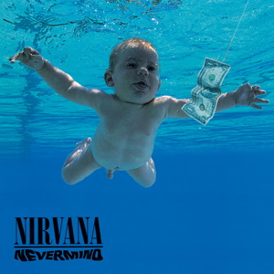
Nevermind by Nirvana was one of the album covers which I thought was interesting and effective. The simple use of having one dominant colour (blue) and the random baby and dollar bill makes the audience think about the album cover. Why is the baby there? Is the dollar bill bait for the baby, and if so why? This album cover is unique to other CD's which makes it stand out, but also clearly shows the name of the artist and album in the bottom left corner. The font on the word 'NEVERMIND' looks to be wavy which resembles being underwater as the album cover shows.
http://ecx.images-amazon.com/images/I/51WcRB-Qt5L.jpg 
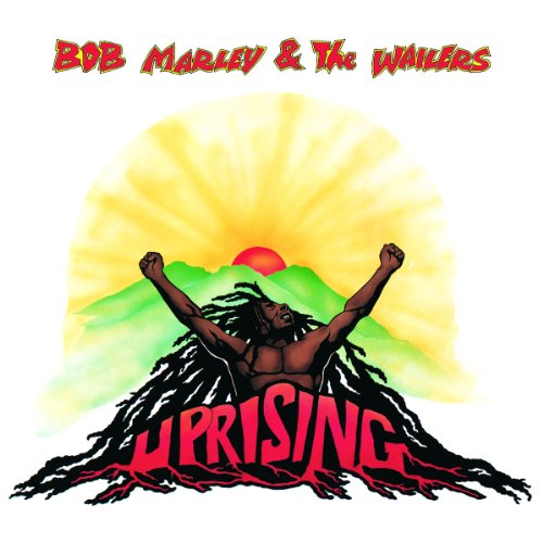
An album that is more relevant to our music video genre 'Ska' was Uprising by Bob Marley as he is in the Reggae genre. The bright colours in contrast to the white background makes this album eye-catching as it is all hand-drawn. The font of 'UPRISING' is implemented into the image and is of a different colour to resemble a volcano with Bob Marley coming out of it. This symbolises Bob Marley rising up in the world as something, perhaps an artist? The use of colours on the font of the artist name and the album name makes it easy to read as well.

As for music DVD's, in store there are a number of genres including Blues, Classical, Pop, Rock, Jazz and more. The most common music DVD I could find was Pop, however there was very few in the genre of Reggae and none specificially in Ska. The one closest to being Ska that I found was the Marley DVD.
http://ecx.images-amazon.com/images/I/81OsYI%2Br%2BLL._SL1130_.jpg 
On the cover of the DVD we can see an image of Bob Marley drawn with the use of 3 colours, red yellow and green. These are known as the 'Bob Marley colours' which symbolise a rastafarian movement and means 'One Love'. This use of colour can be an incentive to do something similiar for our DVD cover if to make one. The ratings of the film on the cover help the audience to know it is a good DVD, as wel las the film being in Blu-Ray which is high quality. A film about Bob Marley himself shows he is someone of importance, and was very successful in his genre when performing. 

All of the DVD's in this section were a mixture of concert performances, documentaries and biographies. Music DVD's help to widen the audience as some people may be interested and not have listened to the genre befoer and want to know more, in which case a documentary would be a good example to gather more information. Concert performances would be appealing to those who would want to go to a concert but couldn't/can't, and biographies are more aimed towards fans towards a specific artist. Finding DVD's however are very hard as there is no categorisation between them as there is in CD's. This tells us that there are not as many DVD's as there are to CD's and CD's are more important.

For CD's, the categorisation puts each genre onto their own shelf in alphabetical order.

http://dhgkpqsiufwl2.cloudfront.net/media/ArticleSharedImage/imageFull/.f1jq3u9U/ArticleSharedImage-54917.jpg 
This is one of the latest releases in Reggae in HMV. The use of mise-en-scene in terms of clothing is accurate in agreeing with the stereotype of a typical reggae artist. The ethnicity of the artist in the album cover alongside with the hat and sunglasses is relevant to the reggae genre. The use of colours is also very clever and 'neat', with the red text of the artist name and album cover standing out.


http://www.reggaeville.com/uploads/tx_shreggae/leviroots-riseabove.jpg
 Another rather recent release is Rise Above by Levi Roots. The use of the sun and being by the sea gives the sense of peace and serenity, which reggae music symbolises. The font is different to that of the other album cover, as this is more traditional reggae with the font looking as though it has been hand-written, and not blocky like the other one.


Friday, 16 October 2015

analysis of 2 music videos we have seen


I think that this video is creative in the editing techniques as it uses a variety of things which make it effective, for example speeding up movements so it almost looks robotic makes the video almost seem dis-jointed which makes it stand out. The only problem is i think that it isn't as effective as 'where are u now' from Justin beiber because the techniques used are minimal, as the only main one was the speeding up and cutting to make it seem robotic. the ideas behind the video weren't really imaginative as although shes clapping her hands up above her head and spinning around which links with the lyrics (Goodwin's rules) the location and props used seem almost too normal to make it seem creative and well thought through.


 Justin's 'Where are u now' is extremely creative in the way he has used techniques of editing and location and lighting to grab the audiences attention. One thing i find really effective is when he green screened the doodle backgrounds where it looked like a sketch pad and also when he outlines his face with lines to make him look like a sketch, i feel the artistic value of this adds to the creativity and makes it interesting to watch. The contrast between the slow and fast pace of the song is highlighted well as when it is the slow part of the song, the visuals slow right down to the focus being on justins face using the lighting sources to make him stand out from the dark backgoround.

Wednesday, 14 October 2015

Creative mise-en-scene stills

 
This is the most creative still for a number of reasons. The location is in a derelict looking location which accompanies the dark clothing being worn by Lucy. The use of the scarf as a prop covering Lucy's mouth connotes suffocation and gives a scary feeling to the audience. This agrees with our binary opposites of being trapped (suffocated) and in a small confined space.


 This is the least creative still. It shows a hand being pressed through a black sheet. It gives a feel of being 'trapped' and the hand is trying to escape which links to our binary opposites of being trapped/having freedom although there is not much to the still. Other than this there is nothing to depict from the still. It is also a little difficult to see the hand at first and which the fast editing we plan to have for our music video this will be difficult to notice and not effective, as well as not being creative enough.


Mise-en-scene Creativity

We personally think the most effective and creative clip was where they filmed from between someones legs and the perspective looked like Ben was in between and was in a triangle. This made it more creative as it differed from a normal shot of a person just standing there.


The least effective clip was when ben was standing to the side singing slightly off centre. this is because there was no thought in camera angle and shooting. so therefore was a normal angle. Also the location of a toilet wouldnt be an ideal location for a top music video. They needed a more creative location for it to be effective in any way.

Tuesday, 13 October 2015

Digipak Analysis


The front cover is very simple and has a close-up/mid shot of David Guetta on the front in black and white with a pair of sunglasses on. This could show that he’s trying to be cool and appeal to the younger fans of teenagers. The picture shows his face and is easily identified even though he has glasses covering his eyes.
The typography of his name is white and bold and his logo which allows the audience to remember where they have seen that font and style before. It stands out against the grey/black background which makes it easy to read and to spot, the name of the album ‘One Love’ is below his name which is in a font that looks like it has been painted in a dark pink/purple colour. This writing could suggest that David Guetta is fairly laid back and wants to have fun with the album and his music. He wants to say that he can do whatever he wants with his album, if it’s his music he can be as creative and wacky with it as much as he wants. This is both similar and different to other dance genre artists, as some don’t want to give away the fact that they are dance music and others want to show that off. 

The actual CD is silver and has writing all over it in the same format as the ‘One Love’. It is messy and has various random lines smeared across it, this matches the dance genre because the colours of the black and pink together almost make it look like a paint party or where a night out might got messy.

On the CD there is also a paragraph that explains the copyright to David Guetta and his record label and that all of his music may not be copied or used without his or the record labels permission. The writing on the CD makes it look like graffiti art and creative.


On the back of the album it has a list of all of the tracks that are on the CD, the colour scheme sticks to black, purple/pink and white and continues the messy paint effect throughout the whole CD cover. The same typography of David Guetta’s signature name is on the back as well so that the audience are familiar with the font and style of his name so that they can recognise him more often. In the bottom corner there is tiny logos of all the record labels and companies that helped with his music, this is a vital part of an album when it comes to making a digipak because we’ll have to choose a record label that matches our genre.